| 일 | 월 | 화 | 수 | 목 | 금 | 토 |
|---|---|---|---|---|---|---|
| 1 | 2 | 3 | 4 | 5 | 6 | 7 |
| 8 | 9 | 10 | 11 | 12 | 13 | 14 |
| 15 | 16 | 17 | 18 | 19 | 20 | 21 |
| 22 | 23 | 24 | 25 | 26 | 27 | 28 |
| 29 | 30 |
- UITableView
- modal
- Swift
- TableView
- ui
- graph
- PyQt
- androidstudio
- alamofire
- kotlin
- Xcode
- Python
- UIKit
- PyQt5
- cocoapods
- button
- UIButton
- 그래프
- Chrats
- Chart
- charts
- Android
- ios
- library
- Storyboard
- 라이브러리
- 개발자
- Apple
- 개발
- 어플리케이션
- Today
- Total
Jiwift
[iOS/Swift] 코드로 Custom Class Button 만들기(커스텀 클래스 버튼) 본문
이번에는 코드를 이용해서 UIButton을 만들어 보도록 하겠습니다. 사실 매우 간단하지만, 처음에는 왜 사용하는지 모를 수도 있을 것 같긴 합니다. 제가 사용하는 이유는 버튼 색상, 폰트와 같이 공통적으로 많이 사용되는 버튼을 Class로 만들어서 관리하고 있습니다.
이렇게 Class로 버튼을 만들면 변경이 생길 경우 유지보수하는데 좋다는 점이 있습니다. 예시는 많은 내용을 담지는 않겠습니다. 기본적인 방법을 익히시고 프로젝트에 맞는 버튼을 만들어보세요.
// 버튼
class PrimaryButton: UIButton {

    // 코드를 통해 인스턴스를 생성할 때 사용되는 이니셜라이저
    override init(frame: CGRect) {
        super.init(frame: frame)
        self.commonInit()
    }

    // Storyboard 통해 생성할 때 사용되는 이니셜라이저
    required init?(coder: NSCoder) {
        super.init(coder: coder)!
        self.commonInit()
    }

    // 공통 설정을 위한 메소드
    private func commonInit() {
        // 여기에 버튼의 기본 설정을 넣어주시면 됩니다.
        self.backgroundColor = .white
        self.layer.cornerRadius = 6
        self.titleLabel?.font = Font.bold(size: 20)
        self.layer.borderColor = .none
        self.layer.borderWidth = 0.5
    }
}
우선 제일 기본적인 방법으로 UIButton을 생성했습니다. Class를 선언하고 UIButton을 채택해 줍니다. 그리고 코드 혹은 스토리보드를 통한 init을 위해서 초기화 함수들을 선언해 줍니다.
저는 기본으로 버튼이 가지고 있어할 옵션을 'commonInit'이라고 이름을 정해서 두 개의 초기화 함수에 넣어주었습니다. 그럼 코드 혹은 스토리보드에서 우리가 만든 Class가 사용될 때 초기 설정을 제대로 할 수 있습니다.
이제 여기서 조금만 더 수정해보겠습니다.
// 활성화 여부
override var isEnabled: Bool {
    didSet { updateStateUI() }
}

// 누름 여부
override var isHighlighted: Bool {
        didSet { updateStateUI() }
}
버튼 활성화 여부와 하이라이트 여부에 다라서 버튼 상태를 변하도록 코드를 추가해 줍니다. 'updateStateUI'라는 함수를 바라보게 해 두었습니다.
// UI 업데이트
private func updateStateUI() {
    switch state {
    case .normal:
    // 기본
        DispatchQueue.main.async {
            self.backgroundColor = .none
        }
    case .highlighted:
    // 터치
        DispatchQueue.main.async {
            self.backgroundColor = .none
        }
    case .disabled:
    // 비활성화
        DispatchQueue.main.async {
            self.backgroundColor = .none
        }
    default:
        break
   }
}
위에서 상태 변화에 따라서 수행되는 위 함수는 각각 버튼 상태에 따라서 배경색을 지정하는 코드를 작성했습니다. 이러면 Custom Class 완성입니다.
버튼의 디자인이 위 코드에서 크게 벗어나지는 않을 것이라고 생각이 듭니다. 한번 잘 작성해 두고 평생 우려먹는 코드로 사용하면 될 것 같습니다.
전체 코드
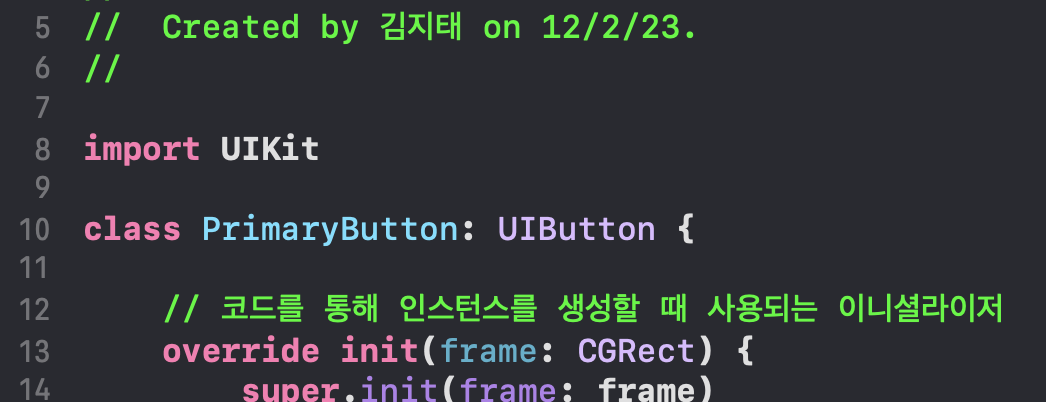
//
//  PrimaryButton.swift
//
//  Created by 김지태 on 12/2/23.
//

import UIKit

class PrimaryButton: UIButton {

    // 코드를 통해 인스턴스를 생성할 때 사용되는 이니셜라이저
    override init(frame: CGRect) {
        super.init(frame: frame)
        self.commonInit()
    }

    // 초기화
    required init?(coder: NSCoder) {
        super.init(coder: coder)!
        self.commonInit()
    }

    // 공통 설정을 위한 메소드
    private func commonInit() {
        // 여기에 버튼의 기본 설정을 넣어주시면 됩니다.
        self.backgroundColor = .white
        self.layer.cornerRadius = 6
        self.titleLabel?.font = Font.bold(size: 20)
        self.layer.borderColor = .none
        self.layer.borderWidth = 0.5
    }

    // 활성화 여부
    override var isEnabled: Bool {
        didSet { updateStateUI() }
    }

    // 누름 여부
    override var isHighlighted: Bool {
            didSet { updateStateUI() }
    }

    // UI 업데이트
    private func updateStateUI() {
        switch state {
        case .normal:
            DispatchQueue.main.async {
                self.backgroundColor = .none
            }
        case .highlighted:
            DispatchQueue.main.async {
                self.backgroundColor = .none
            }
        case .disabled:
            DispatchQueue.main.async {
                self.backgroundColor = .none
            }
        default:
            break
       }
    }
}
'iOS Dev > UIKit' 카테고리의 다른 글
| [iOS/Swift] WebKit inspector 로그 확인, isInspectable, 검사할 수 있는 응용 프로그램 없음 (0) | 2023.12.24 |
|---|---|
| [iOS/Swift] UITextField 글자수 제한, 글자수 세기 (0) | 2023.12.18 |
| [iOS/Swift] UIScrollView와 비교를 통해 가볍게 알아보는 UITableView, UIKit 기본 (0) | 2023.08.01 |
| [iOS/Swift] UIView 배경색 변경, backgroundColor (0) | 2023.06.27 |
| [iOS/Swift] RadioButton - UIButton을 사용해서 라디오 버튼 만들기, 내가 생각하는 방법 (0) | 2023.01.10 |


